
Top House Painting Trends in Adelaide for 2026
Why colour matters in Adelaide
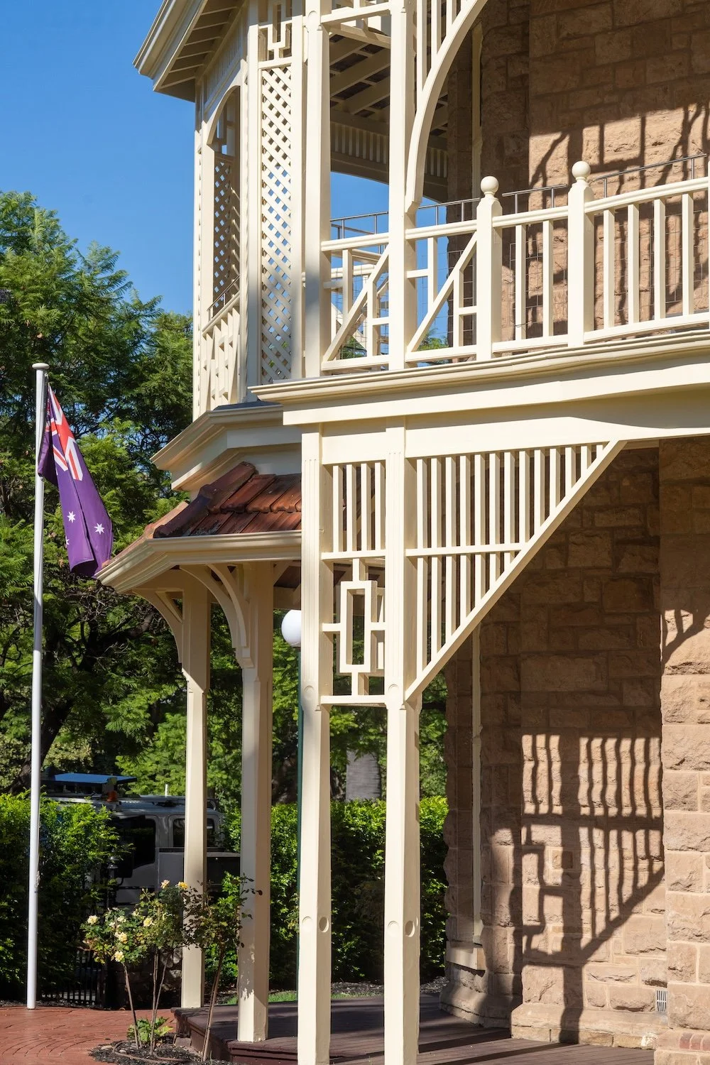
Adelaide enjoys a Mediterranean climate with hot, dry summers and mild winters. Sunlight here is bright and can bleach out cool colours. Australian paint experts note that our light softens and mutes colour in ways unique to our hemisphere. Choosing the right palette therefore isn’t just about style, it affects how large, warm and inviting a room feels. Colour forecasts for 2026 emphasise palettes that foster calm, connection and emotional clarity, while local painters note a move away from cool greys towards warm, “baked” neutrals and rich browns that counteract grey winter light.
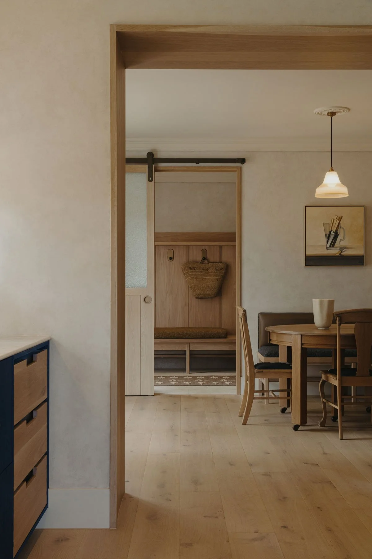
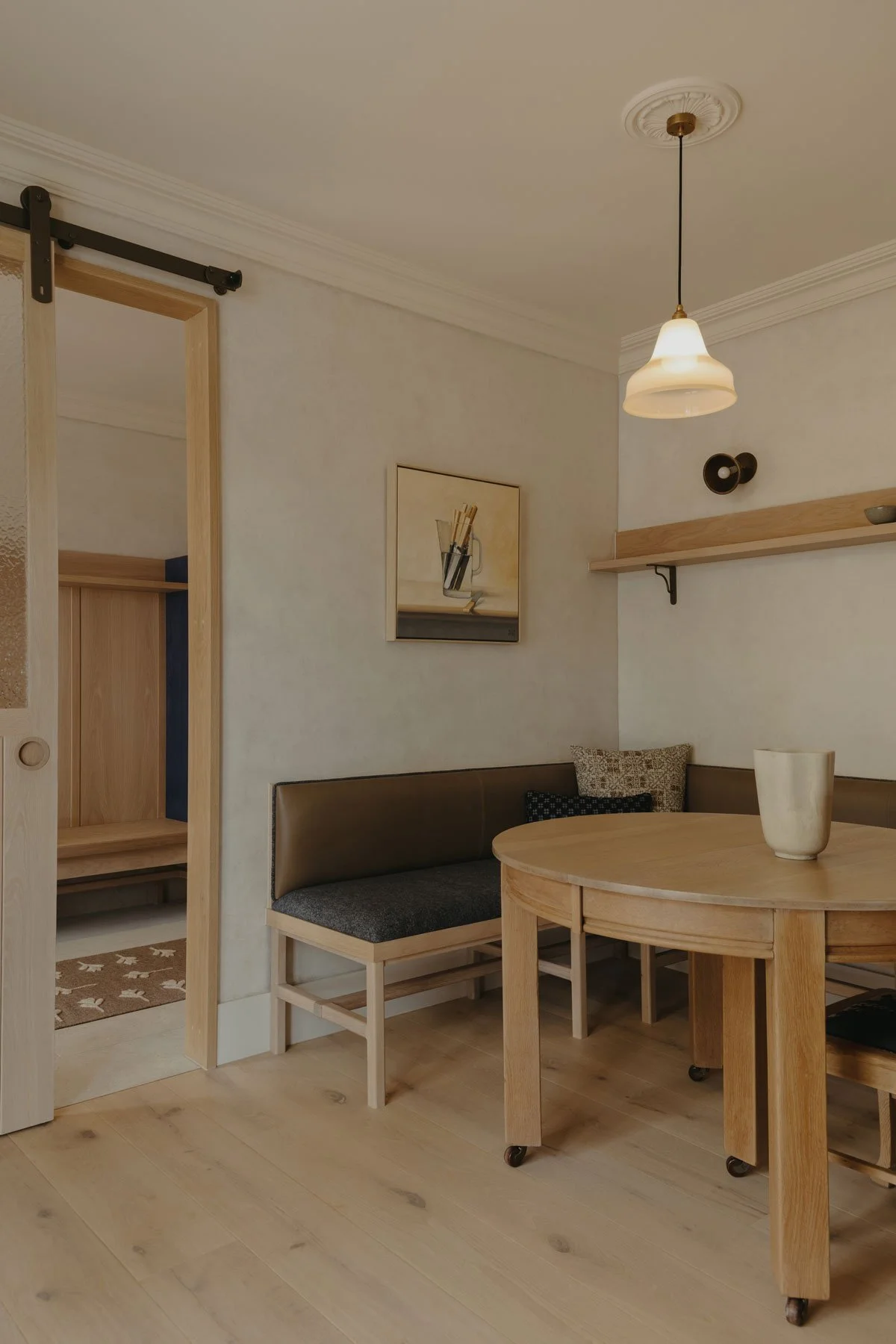
1. Warm earth‑based neutrals replace cool greys
The biggest shift for 2026 is the demise of cold greys. Analysis of upcoming colour forecasts notes that cool greys are officially out, while warm neutrals like terracotta and biscuit are taking over. These earth‑based neutrals feel like a warm hug and work beautifully with Adelaide’s natural light. Browns are now the new anchor colour: from espresso to chocolate, rich browns add drama without the harshness of black.
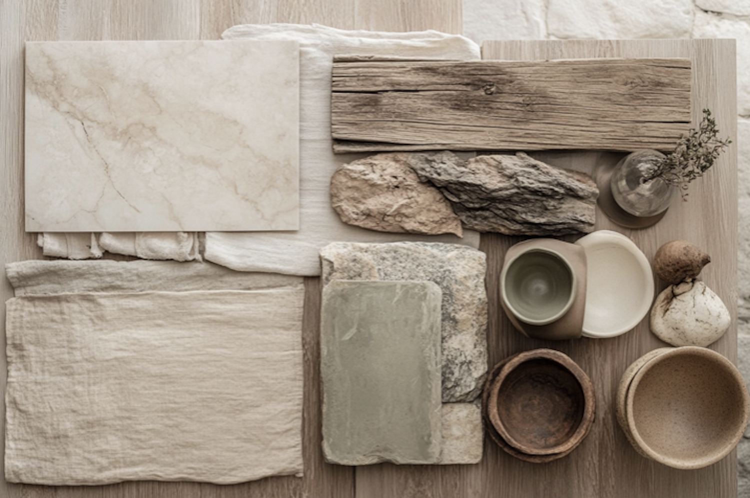
Haymes’ Colour Library reinforces this trend through its New Terrain and Solid Ground palettes. New Terrain draws on neutral, natural colours such as sun‑drenched whites and earthy terracotta and encourages a slower pace of living. Solid Ground is anchored in robust neutrals, with olive, rich blues and earthy reds inspired by Australia’s rainforests and oceans. To introduce warmth:
Sun‑drenched neutrals & creams – The New Terrain palette features sun‑drenched whites and warm creams that reflect Adelaide’s bright light. Use them as wall colours to create a serene backdrop.
Terracotta & baked clay – Earthy terracotta and clay hues in New Terrain evoke Australia’s interior landscapes. These colours bring comfort to living rooms or entryways.
Olive, deep blues & rich reds – Solid Ground combines grounding neutrals with olive greens, ocean‑inspired blues and rich reds. Use these hues on cabinetry, doors or accent walls to add depth without resorting to black.
2. Haymes Colour Library & Colours of Australia: palettes to know
Haymes’ Colour Library is a curated series of palettes released annually. The Volume 17 collection, Origins, comprises six palettes that speak directly to current trends:
New Narratives – A fusion of bright pastels and bold hues that encourage complementary combinations. Habitus notes that this palette uses soft pastels with small moments of colour to create variation. Think powder blue walls with pops of buttery yellow or coral in accessories. This palette works well in kids’ rooms, home offices or anywhere you want energy and optimism.
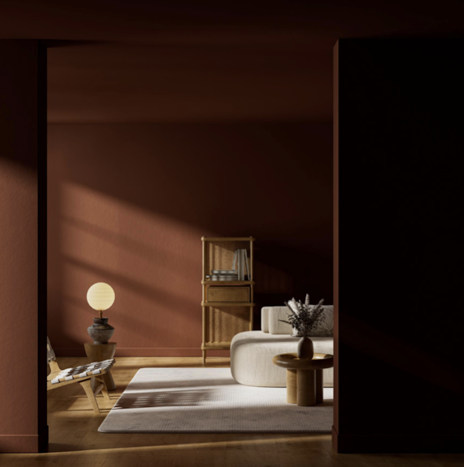
Heritage Hues – A rich, moody tonal palette designed for cocooning. Interiors Addict describes how dark shades like the muted deep green “Florida Everglade” create a subtle but invigorating depth; the palette plays with translucency and reflection to create a “colour hug”. Use it on walls, trims and ceilings in heritage villas or libraries to define space and evoke intimacy.
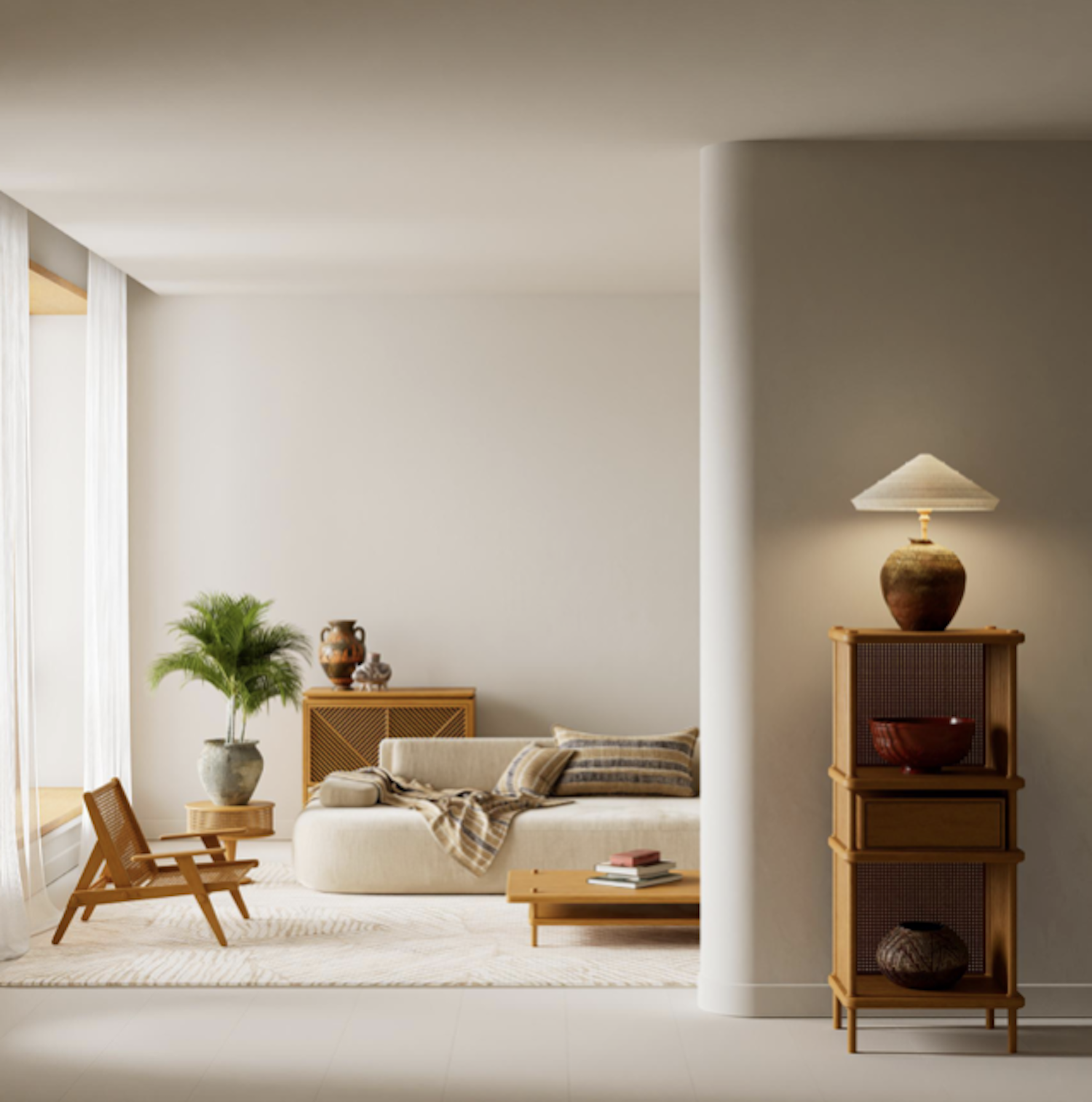
New Terrain – A range of neutral, natural colours reflecting Australia’s earthy tones. It includes sun‑drenched whites and terracotta hues that whisk you away to sunny memories. Perfect for open‑plan living areas, this palette promotes calm and connection.
Retro Mash Up – A dynamic palette mixing vintage charm with modern flair. Interiors Addict notes that it uses bold primary colours with a 1970s overtone and encourages experimentation. Try an olive feature wall with mustard cushions, or paint a small powder room in an unexpected bold colour.
Solid Ground – Anchored in robust neutrals inspired by earth, rainforests and oceans. This palette includes olive, rich blues and reds and celebrates natural materials like terracotta and stone. Use it to ground interiors and tie them back to nature.
Strong Haven – A neutral palette influenced by Brutalist architecture, combining structure with organic serenity. Habitus explains that it balances sharpness and mass materiality with warm textures like rammed earth and natural wood. Ideal for contemporary homes where you want to emphasise architectural form while maintaining warmth.
The Colours Defining Homes in 2026
From earthy neutrals to rich, grounding tones, today’s palettes are designed to elevate your space while reflecting the natural beauty of South Australia.
Haymes also released the Colours of Australia palette (Volume 18). This collection takes inspiration from the natural beauty of Australia’s diverse landscapes.
It features forty colours that reflect our environment, from the Dusted Tan of the Fleurieu Peninsula in South Australia and the Awe Inspired of the Blue Mountains in New South Wales to the Light Stone of the Northern Territory.
The palette is designed as an enduring collection rather than a passing trend; Haymes notes that it reinforces the sanctuary of our homes and is grounded in nearly 90 years of colour expertise. Colour lead Rachel Lacy explains that the palette encourages people to embrace combinations they might not otherwise try, as each colour has been chosen to work together cohesively. Use this palette to draw on regional landscapes and create personalised schemes.
3. Colour drenching: the technique of 2026
Beyond individual colours, how you use paint matters. Colour drenching involves painting walls, skirting boards, cornices and even ceilings in the same shade. The effect blurs room boundaries, making spaces feel larger and cohesive. Golden Deco suggests deep olive green, navy or terracotta as ideal drenching colours. With Haymes’ palettes, consider drenching a room in Heritage Hues’ deep green or Solid Ground’s olive to create a cocooning feel, or use a pastel from New Narratives for a soft, enveloping effect.
4. Heritage inspiration: Heirloom hues for character homes
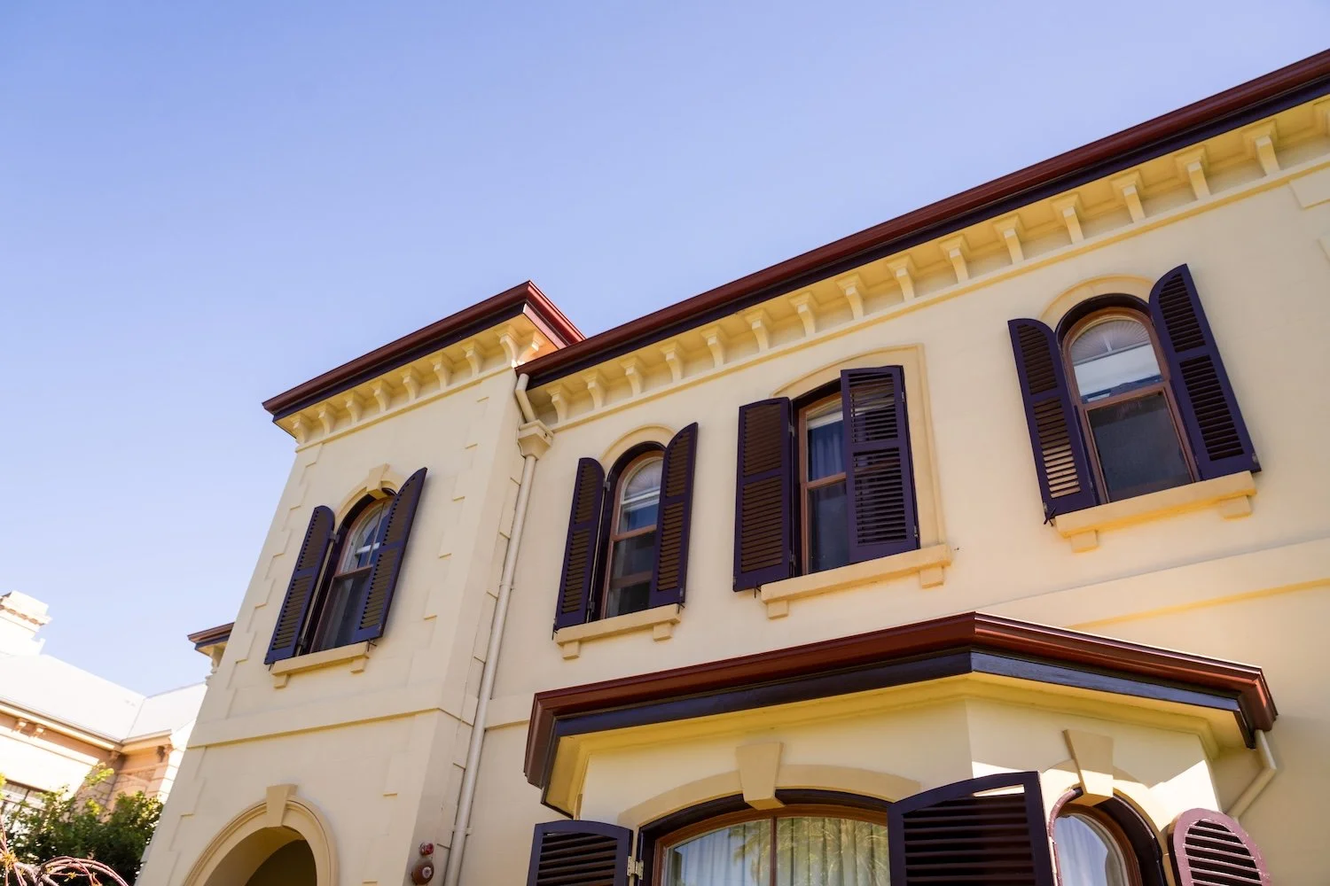
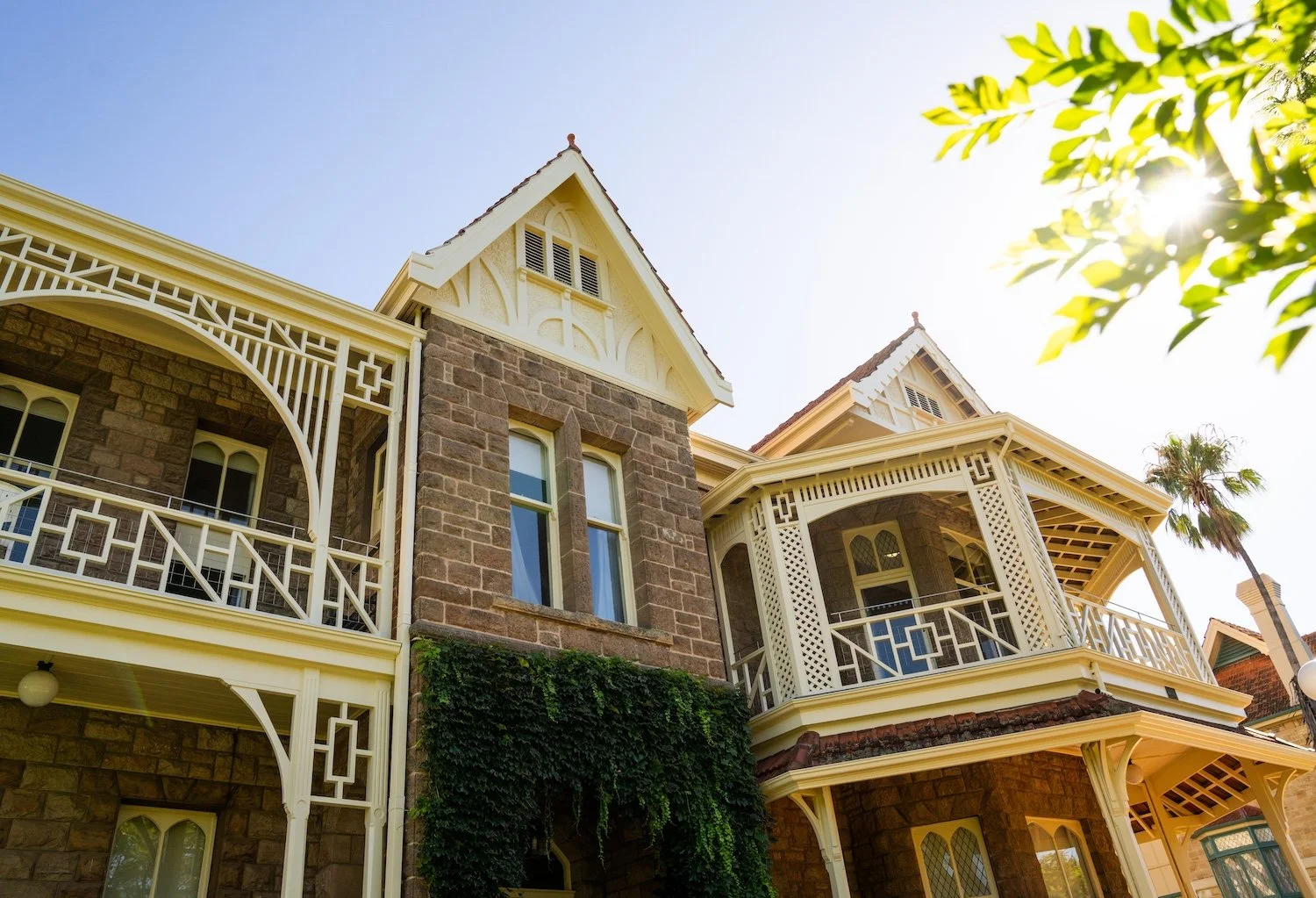
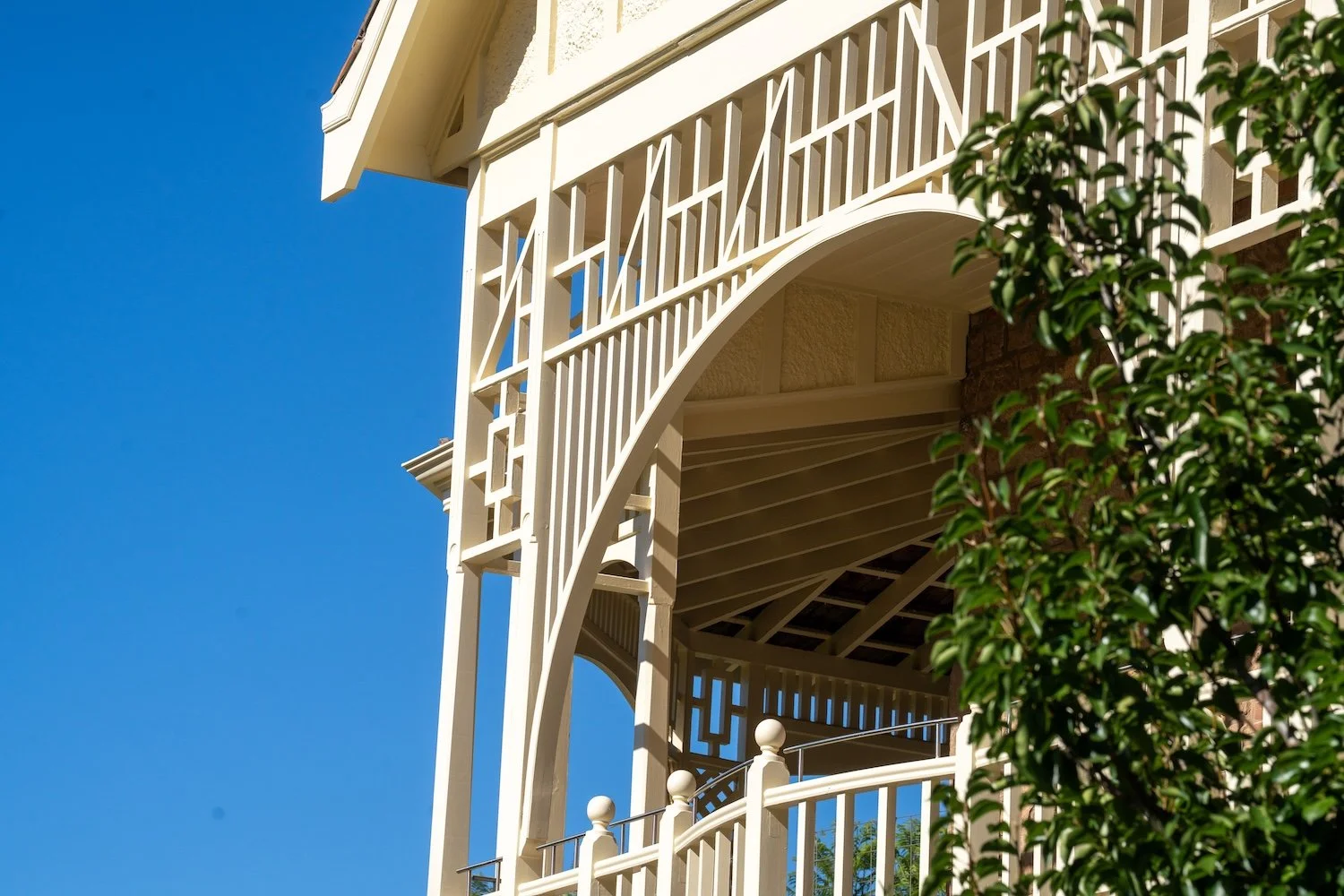
Adelaide boasts numerous heritage villas and cottages. For these character‑filled homes, look beyond plain white. Interiors Addict notes that Heritage Hues uses dark shades like Florida Everglade to create a tranquil environment reminiscent of an intimate reading room. Painting walls, trims and ceilings in a single dark hue envelops the room in a comforting “colour hug”. Pair these moody colours with brass hardware, heavy drapery and antique furniture to elevate period features.
Heritage inspiration isn’t limited to dark hues. The Colours of Australia palette includes nature‑inspired tones that reference Australian landscapes, such as Dusted Tan and Light Stone. Use these on exteriors to complement sandstone or brickwork, or pair them with deep greens and burgundy accents for a classic, timeless look. For interior details, consider muted terracotta or olive from New Terrain or Solid Ground to bring warmth without overpowering architectural details.
5. Exterior trends: warmth and nature
Exterior colours in 2026 emphasise warmth, longevity and connection to nature. Soft, earth‑inspired neutrals like creamy taupes, sandstone and warm beiges are replacing stark whites for facades. These shades reflect sunlight without glare and pair well with Adelaide’s sandstone architecture. Nature‑inspired greens, such as sage and olive, dominate exterior trends because they harmonise with gardens and the Australian landscape. The Colours of Australia palette provides ready‑made options, from dusty tan to sun‑bleached stone, that are appropriate for Adelaide’s coastal or rural settings.
6. Sustainability and wellness
Colour trends are intertwined with sustainability and wellness. Worthington Homes notes that colour should be considered alongside material and light, as colour is always in dialogue with material, form and light. The 2026 forecast encourages slow living and thoughtful consumption; materials are durable and easy to repair. Haymes’ palettes pair naturally with low‑VOC paints and sustainable materials like stone and timber. In practice:
Choose eco‑friendly paints – Low‑VOC paints improve indoor air quality and are available across Haymes’ ranges.
Pair colours with natural materials – New Terrain and Solid Ground palettes look best alongside stone, concrete and timber, creating a grounded feel.
Use vintage and repurposed furniture – Retro Mash Up’s vintage‑inspired hues work beautifully with reclaimed pieces.
Bring nature indoors – Integrate biophilic colours like moss green, sage and muted blues from Colours of Australia to promote wellbeing and calm.
7. Tips for choosing your 2026 palette
1. Consider room purpose and light. South‑facing rooms may feel cold in cool whites; choose warm neutrals like sun‑drenched cream or Dusted Tan to mimic golden‑hour sunlight.
2. Use warm neutrals as a base. They adapt to shifting sunlight and different interior styles.
3. Add depth with accents. Introduce moody hues (deep blues, olive green, espresso brown) in smaller doses to ground a space. Haymes’ Solid Ground and Heritage Hues palettes provide many options.
4. Embrace colour drenching in small spaces. It creates cohesion and makes rooms feel larger.
5. For heritage homes, respect character. Use heritage‑appropriate colours and highlight architectural details; pair neutrals with deep reds or greens for contrast.
6. Test paints in your home. Order sample pots or large swatches from Haymes to see how colours behave in Adelaide’s light. The Colours of Australia palette is designed to encourage experimentation, with no wrong combinations.
Painting for connection and comfort
In 2026, Adelaide homeowners are moving beyond bland, cool palettes towards warm neutrals, earthy tones and personality‑driven colour. Haymes’ Colour Library, with palettes like New Narratives, Heritage Hues and New Terrain – offers versatile atmospheres, while the Colours of Australia collection pays homage to our landscapes and encourages creative combinations. Techniques like colour drenching and heritage‑inspired accents add depth and individuality. Whether you’re updating a contemporary townhouse or restoring a heritage villa, these trends will help you create a home that feels connected, calm and unmistakably Adelaide.
Bring Your Home Back to Life
Expert preparation and premium finishes ensure your home not only looks incredible but stands the test of time.
If you’d like personalised advice or a quote for your 2026 painting project, our team at Snyders Painting specialises in high‑end residential and heritage homes. Get in touch to explore how these trends can transform your space.